Conan Mercer Site Reliability Engineering Team Lead
Graphing in Python, The Pie Chart
11 Jul 2020 - Conan Mercer
The Basics
Creating informative plots that look appealing is a very useful skill in any STEM related field of work or study. Like most I used Excel for many years, but it was in post graduate school that I looked into using more sophisticated plotting methods to more accurately display the information I was generating.A quick bit of research lead me to Python, and an associated library called MatPlotLib. Here are some examples of how to plot using Python. For a guide on how to install and setup the correct environment to begin using MatPlotLib, look here.
Code for the most basic Pie Chart
Aesthetics
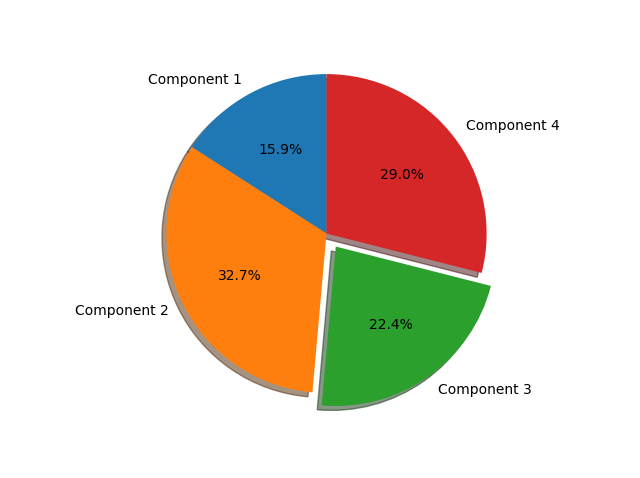
The previous pie chart did little in the way of effort towards presentation. MatPlotLib is a very powerful library that can be manipulated and customized to a large degree. Below in Figure 2 we use the same data as in Figure 1, however this time we punch a hole in the middle to give resemblance to a donut, we also add a title and change the colour scheme. Also present in the code is a method to output the pie chart, with two options, the file path and also the desired resolution in dots per inch (dpi).
Code for an aesthetic Colour Pie Chart

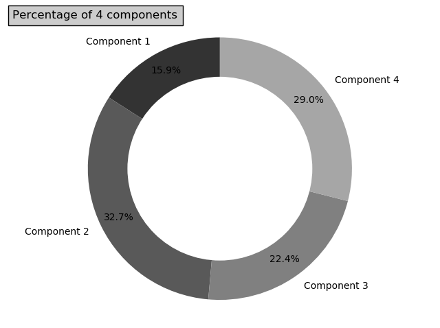
Sometimes it might not be appropriate to use colour. An obvious example is that people with colour blindness may have difficulty differentiating between parts of a plot. Another is that colour is a subjective entity, some may like the colours you choose, others may not. To rule these problems out I often use a gray scale to show differences between data sets, see Figure 3.
Code for an aesthetic Grey Scale Pie Chart