Conan Mercer Site Reliability Engineering Team Lead
Understanding the Pitfalls of the Pie Chart
13 Nov 2021 - Conan Mercer
Failure to Convey
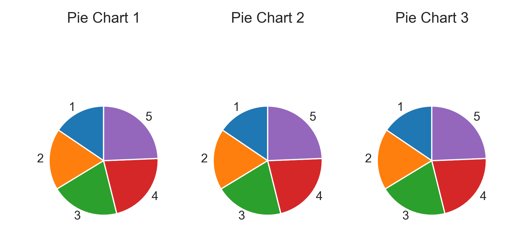
The only reason to create a plot is to accurately present data. Without exception, the human eye is involved in this process, so its peculiarities must be considered. The fact is that small differences in a pie chart are poorly recognized by the human eye.For instance, take a set of data that is similar, but not the same in value. In Figure 1 below, try to determine which component has the highest value. Even better, try to rank order these values from highest to lowest.
Its difficult.
Same Data, Different Plot
A significantly different (and accurate) story is told if the exact same data is presented using a bar plot. The bar plot is nearly always the stronger contender against the pie chart. The data clearly trends in contradictory directions in each of these bar plots, something that would have been lost to the audience if the pie chart had been utilized.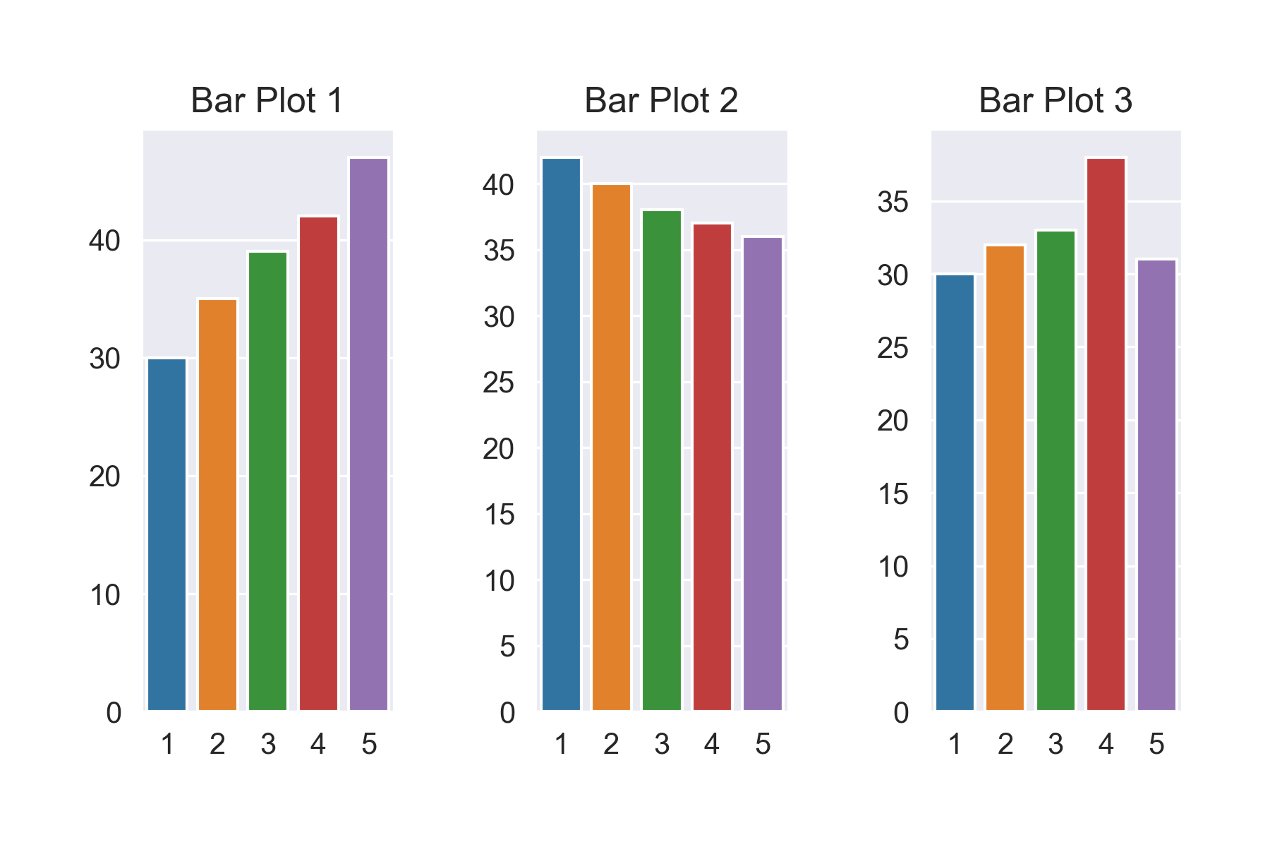
Think Twice, Present Once
This post is not intended to be a hit piece on the pie chart, for it does have some utility. When comparing two datasets, where one is significantly bigger than the other, maybe a pie chart is appropriate.In any case, this is a reminder that careful consideration is always required when presenting data.
The morale, think twice before choosing the pie chart.